How to deal with Wikipedia’s broken graphs and charts by avoiding Web technology escalation
Thursday, February 15th, 2024Almost a year ago, a huge number of graphs and charts on Wikipedia became unviewable because a security issue had been identified in the underlying JavaScript libraries employed by the MediaWiki Graph extension, necessitating this extension’s deactivation. Since then, much effort has been expended formulating a strategy to deal with the problem, although it does not appear to have brought about any kind of workaround, let alone a solution.
The Graph extension provided a convenient way of embedding data into a MediaWiki page that would then be presented as, say, a bar chart. Since it is currently disabled on Wikipedia, the documentation fails to show what these charts looked like, but they were fairly basic, clean and not unattractive. Fortunately, the Internet Archive has a record of older Wikipedia articles, such as one relevant to this topic, and it is able to show such charts from the period before the big switch-off:
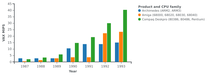
Performance evolution of the Archimedes and various competitors: a chart produced by the Graph extension
The syntax for describing a chart suffered somewhat from following the style that these kinds of extensions tend to have, but it was largely tolerable. Here is an example:
{{Image frame
 | caption=Performance evolution of the Archimedes and various competitors
 | content = {{Graph:Chart
 | width=400
 | xAxisTitle=Year
 | yAxisTitle=VAX MIPS
 | legend=Product and CPU family
 | type=rect
 | x=1987,1988,1989,1990,1991,1992,1993
 | y1=2.8,2.8,2.8,10.5,13.8,13.8,15.0
 | y2=0.5,1.4,2.8,3.6,3.6,22.2,23.3
 | y3=2.1,3.4,6.6,14.7,19.2,30,40.3
 | y4=1.6,2.1,3.3,6.1,8.3,10.6,13.1
 | y1Title=Archimedes (ARM2, ARM3)
 | y2Title=Amiga (68000, 68020, 68030, 68040)
 | y3Title=Compaq Deskpro (80386, 80486, Pentium)
 | y4Title=Macintosh II, Quadra/Centris (68020, 68030, 68040)
}}
}}
Unfortunately, rendering this data as a collection of bars on two axes relied on a library doing all kinds of potentially amazing but largely superfluous things. And, of course, this introduced the aforementioned security issue that saw the whole facility get switched off.
After a couple of months, I decided that I wasn’t going to see my own contributions diminished by a lack of any kind of remedy, and so I did the sensible thing: use an established tool to generate charts, and upload the charts plus source data and script to Wikimedia Commons, linking the chart from the affected articles. The established tool of choice for this exercise was gnuplot.
Migrating the data was straightforward and simply involved putting the data into a simpler format. Here is an excerpt of the data file needed by gnuplot, with some items updated from the version shown above:
# Performance evolution of the Archimedes and various competitors (VAX MIPS by year)
#
Year    "Archimedes (ARM2, ARM3)" "Amiga (68000, 68020, 68030, 68040)" "Compaq Deskpro (80386, 80486, Pentium)" "Mac II, Quadra/Centris (68020, 68030, 68040)"
1987    2.8     0.5     2.1     1.6
1988    2.8     1.5     3.5     2.1
1989    2.8     3.0     6.6     3.3
1990    10.5    3.6     14.7    6.1
1991    13.8    3.6     19.2    8.3
1992    13.8    18.7    28.5    10.6
1993    15.1    21.6    40.3    13.1
Since gnuplot is more flexible and more capable in parsing data files, we get the opportunity to tabulate the data in a more readable way, also adding some commentary without it becoming messy. I have left out the copious comments in the actual source data file to avoid cluttering this article.
And gnuplot needs a script, requiring a little familiarisation with its script syntax. We can see that various options are required, along with axis information and some tweaks to the eventual appearance:
set terminal svg enhanced size 1280 960 font "DejaVu Sans,24"
set output 'Archimedes_performance.svg'
set title "Performance evolution of the Archimedes and various competitors"
set xlabel "Year"
set ylabel "VAX MIPS"
set yrange [0:*]
set style data histogram
set style histogram cluster gap 1
set style fill solid border -1
set key top left reverse Left
set boxwidth 0.8
set xtics scale 0
plot 'Archimedes_performance.dat' using 2:xtic(1) ti col linecolor rgb "#0080FF", '' u 3 ti col linecolor rgb "#FF8000", '' u 4 ti col linecolor rgb "#80FF80", '' u 5 ti col linecolor rgb "#FF80FF"
The result is a nice SVG file that, when uploaded to Wikimedia Commons, will be converted to other formats for inclusion in Wikipedia articles. The file can then be augmented with the data and the script in a manner that is not entirely elegant, but the result allows people to inspect the inputs and to reproduce the chart themselves. Here is the PNG file that the automation produces for embedding in Wikipedia articles:
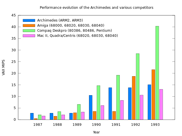
Performance evolution of the Archimedes and various competitors: a chart produced by gnuplot and converted from SVG to PNG for Wikipedia usage.
Embedding the chart in a Wikipedia article is as simple as embedding the SVG file, specifying formatting properties appropriate to the context within the article:
[[File:Archimedes performance.svg|thumb|upright=2|Performance evolution of the Archimedes and various competitors]]
The control that gnuplot provides over the appearance is far superior to that of the Graph extension, meaning that the legend in the above figure could be positioned more conveniently, for instance, and there is a helpful gallery of examples that make familiarisation and experimentation with gnuplot more accessible. So I felt rather happy and also vindicated in migrating my charts to gnuplot despite the need to invest a bit of time in the effort.
While there may be people who need the fancy JavaScript-enabled features of the currently deactivated Graph extension in their graphs and charts on Wikipedia, I suspect that many people do not. For that audience, I highly recommend migrating to gnuplot and thereby eliminating dependencies on technologies that are simply unnecessary for the application.
It would be absurd to suggest riding in a spaceship every time we wished to go to the corner shop, knowing full well that more mundane mobility techniques would suffice. Maybe we should adopt similar, proportionate measures of technology adoption and usage in other areas, if only to avoid the inconvenience of seeing solutions being withdrawn for prolonged periods without any form of relief. Perhaps, in many cases, it would be best to leave the spaceship in its hangar after all.