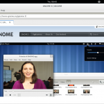
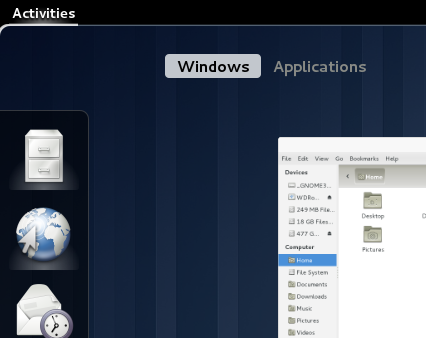
I’m now running Gnome3 from a USB stick and it’s great! There are many, many improvements over the previous version. You should try it (however be careful, since it’s not yet packaged in debian or other distributions, you may be frustrated and have to be patient!)
Now, some things are a bit weird, so I just wanted to give some feedback.
I don’t know if it’s specific to gnome3 or just the live image, but Nautilus was not a “Favourite” application. So, when I just wanted to access my files, well… it was a bit complicated!
Well. My personal taste is that the title of the window is too big and waste my precious vertical space. If you add to it the old menu “File, Edit, View” I still don’t understand why this thing is there. I mean, a lot of applications shouldn’t use them. The thing I really liked about Ubuntu’s Unity is the way it manages this menu (à la Mac Os, you would say, I would just say it’s the smart way).
And if you look above, the “Epiphany” is, I think, just perfect for that 🙂 right now, when you click on it all you get is the possibility to “Quit.” Admit that it’s weird.
So as you see, these are really minor concerns. All the rest so far is really awesome. I can’t wait!


