Finally LibAttica has landed in kdesupport (that’s where additional libraries are kept, that are not by definition part of kdelibs). Téo promised to bring his price winning Amarok about dialog into KDE-Land for KDE 4.5 🙂
I am just about to finish the first big big re-factoring of our Get Hot New Stuff framework. Since it got ported to KDE 4, Jeremy kept it up and running but didn’t have a chance to run with it due to some issues that belong to the land of “real life”. I poked at it two years ago, but then I’m a lazy bummer, so nothing at all happened there either.
Finally, Frank pushed me to get around and do work work on the dialog. The version in our re-factoring branch is ready to be merged into kdelibs, take advantage of LibAttica and just wants to put a smile on your face. Well, it’s not quite there yet, some features are missing – just the ones that are important to me 🙁 that is the social community interaction part. Rating items, seeing more information about the author and so on. But with LibAttica doing the actual work, it’s at the tips of my fingers. Just need to do the right connections. So far I’ve been redoing all the backend stuff.
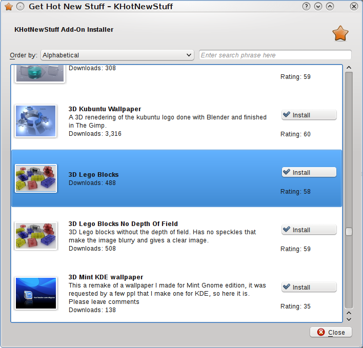
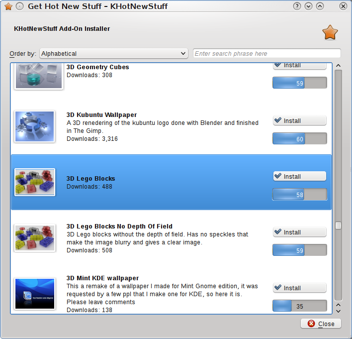
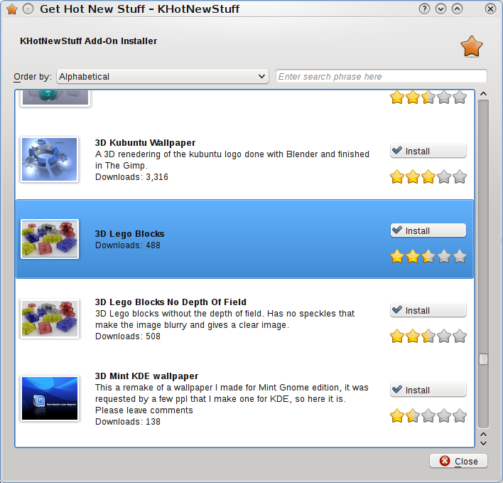
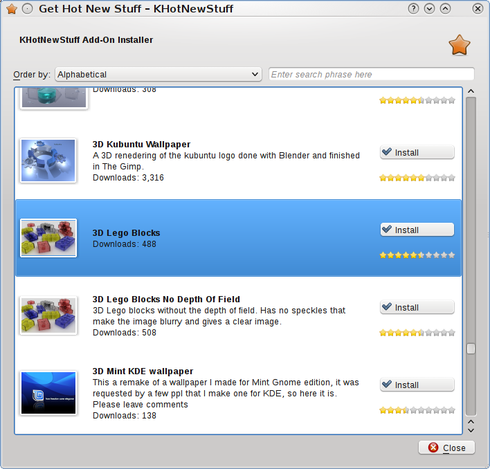
It”s time to start polishing our good old dialog a bit. And here I’d like feedback from you! I have experimented with different ways of showing the rating of an item. Let’s say, we get a number between 0 and 100, how should we represent that in the user interface? In the original version we showed the number “Rating: 79”. Maybe not the most visual way. How about a progress bar? Nope, doesn’t really fit. Nepomuk uses stars. Those fit very well with the “Get Hot New Stars” icon that we have for “Get Hot New Stuff”. So why not go and borrow the widget? In the first iteration, I used 5 stars, just like Nepomuk. But it didn’t seem quite right to reduce the large range 0-100 to that. Plus the widget looks insanely huge and dominates the dialog just a bit too much for my taste. So I personally prefer the ten-little-stars variant.
But I probably think much too limited, knowing what goes on in the background… And I still have the old dialogs in mind. So dear reader, let me see some creative mockups, ideas and fresh ways to go about this dialog and it’s layout, contents and so on. Why not layout items in a grid? Something completely different? Throw it at me. Maybe the next version will be yours! Should we have different layouts for showing Wallpapers (images in general) and things that don’t necessarily have preview pictures? Vocabulary files usually are not that visible. Plasma Applets should have a preview, but here the text is important.
You can reach me at lastname@kde.org. Since Frederik is my firstname, use the other one 😉
And if you ask yourself as developer, what will change, that’s easy to explain. Instead of having the somewhat strange logic of going through a class to give you a dialog, you will use the new dialog just like any other KDialog – either modal or not. When you’re done with it, ask it for a list of changed or updated items and be happy 😉 The only thing you need as well is a appname.knsrc file which is just a KConfig file that contains a bit of information about where to download from, how to install the items. That’s usually two lines and I’ll put an updated tutorial on techbase. Speaking of which, I started a small Attica tutorial, let me know if you’d like to read on or there’s something unclear about it. Porting an application that uses the Hot New Stuff framework already should take no longer than ten minutes.
Many thanks to Frank and hive01.com for making this possible!