Bobulate
Home [ade] cookies
What a difference fontconfig makes
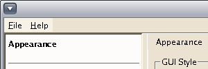
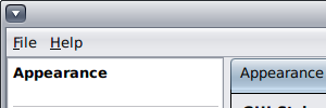 Time for a collection of screenshots, as an illustration of Qt applications on OpenSolaris, both on a local display driven by a Radeon X1200 and on a Sun Ray thin client. Not from KDE applications (although we have KDE 4.3.0 packages for OpenSolaris now) but from qtconfig — possibly the first Qt app you will want to run in OpenSolaris to set up some of the fonts correctly. Before running this version of qtconfig, I removed ~/.config — the whole directory tree — so I would get the default settings. There are screenies of the same 300×100 section of the application on four setups: local display or Sun Ray thin client, and system fontconfig or one built from our own packages. I switched my set of package builds to use the system’s fontconfig a while back, but the specfile for fontconfig (useful if you care about Solaris10) is still there. Both are version 2.5.0; for freetype system is 2.3.7 and the specfiles build 2.3.6.
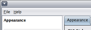 So you would expect very little difference between the two, possibly only a difference in the default fonts. You could use some kind of png diff tool to see the differences, but it’s not a whole heck of a lot.
A bigger change happens when you switch from a local display (even a lousy onboard X1200) to a Sun Ray thin client display. I know I’ve ragged on parts of Qt in the past and the way KDE deals with less-capable displays, so this time I’m not going anywhere near graphics views.
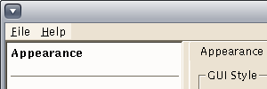 What strikes me immediately is that the style has changed, from one display to another; it now looks a good deal more Morif like. Eww! So what is Qt looking at here to change style like that? (That’s a lazyweb question).
 And switching fontconfigs doesn’t do much again. I’m actually curious if either of the fontconfigs does anti-aliasing right now.
One thing you can’t see in the screenie is the window titlebar. Whatever the default GNOME window manager is — metacity? — produces really ugly title bars on a Sun Ray, as it looks like the AA falls over, producing hard-to-read letters with white-ish strips between them. Those are screenies for another day.